Stellar Parameters Hess Diagram
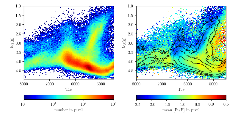
This example shows how to create Hess diagrams of the Segue Stellar Parameters Pipeline (SSPP) data to show multiple features on a single plot. The left panel shows the density of the points on the plot. The right panel shows the average metallicity in each pixel, with contours reflecting the density shown in the left plot.
# Author: Jake VanderPlas <vanderplas@astro.washington.edu>
# License: BSD
#   The figure is an example from astroML: see http://astroML.github.com
import numpy as np
from matplotlib import pyplot as plt

#------------------------------------------------------------
# Get SDSS SSPP data
from astroML.datasets import fetch_sdss_sspp
data = fetch_sdss_sspp()

# do some reasonable magnitude cuts
rpsf = data['rpsf']
data = data[(rpsf > 15) & (rpsf < 19)]

# get the desired data
logg = data['logg']
Teff = data['Teff']
FeH = data['FeH']

#------------------------------------------------------------
# Plot the results using the binned_statistic function
from astroML.stats import binned_statistic_2d
N, xedges, yedges = binned_statistic_2d(Teff, logg, FeH,
                                        'count', bins=100)
FeH_mean, xedges, yedges = binned_statistic_2d(Teff, logg, FeH,
                                               'mean', bins=100)

# Define custom colormaps: Set pixels with no sources to white
cmap = plt.cm.jet
cmap.set_bad('w', 1.)

cmap_multicolor = plt.cm.jet
cmap_multicolor.set_bad('w', 1.)

# Create figure and subplots
fig = plt.figure(figsize=(8, 4))
fig.subplots_adjust(wspace=0.25, left=0.1, right=0.95,
                    bottom=0.07, top=0.95)

#--------------------
# First axes:
plt.subplot(121, xticks=[4000, 5000, 6000, 7000, 8000])
plt.imshow(np.log10(N.T), origin='lower',
           extent=[xedges[0], xedges[-1], yedges[0], yedges[-1]],
           aspect='auto', interpolation='nearest', cmap=cmap)
plt.xlim(xedges[-1], xedges[0])
plt.ylim(yedges[-1], yedges[0])
plt.xlabel(r'$\mathrm{T_{eff}}$')
plt.ylabel(r'$\mathrm{log(g)}$')

cb = plt.colorbar(ticks=[0, 1, 2, 3],
                  format=r'$10^{%i}$', orientation='horizontal')
cb.set_label(r'$\mathrm{number\ in\ pixel}$')
plt.clim(0, 3)

#--------------------
# Third axes:
plt.subplot(122, xticks=[4000, 5000, 6000, 7000, 8000])
plt.imshow(FeH_mean.T, origin='lower',
           extent=[xedges[0], xedges[-1], yedges[0], yedges[-1]],
           aspect='auto', interpolation='nearest', cmap=cmap_multicolor)
plt.xlim(xedges[-1], xedges[0])
plt.ylim(yedges[-1], yedges[0])
plt.xlabel(r'$\mathrm{T_{eff}}$')
plt.ylabel(r'$\mathrm{log(g)}$')

cb = plt.colorbar(ticks=np.arange(-2.5, 1, 0.5),
                  format=r'$%.1f$', orientation='horizontal')
cb.set_label(r'$\mathrm{mean\ [Fe/H]\ in\ pixel}$')
plt.clim(-2.5, 0.5)

# Draw density contours over the colors
levels = np.linspace(0, np.log10(N.max()), 7)[2:]
plt.contour(np.log10(N.T), levels, colors='k', linewidths=1,
            extent=[xedges[0], xedges[-1], yedges[0], yedges[-1]])

plt.show()