Unbinned Poisson Data
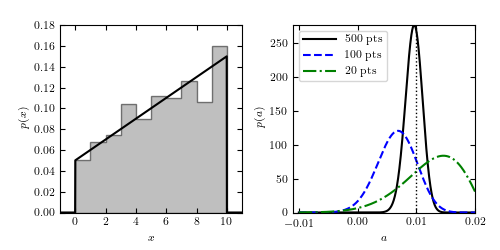
Figure 5.14
Regression of unbinned data. The distribution of N = 500 data points is shown in the left panel; the true pdf is shown by the solid curve. Note that although the data are binned in the left panel for visualization purposes, the analysis is performed on the unbinned data. The right panel shows the likelihood for the slope a (eq. 5.88) for three different sample sizes. The input value is indicated by the vertical dotted line.
# Author: Jake VanderPlas
# License: BSD
#   The figure produced by this code is published in the textbook
#   "Statistics, Data Mining, and Machine Learning in Astronomy" (2013)
#   For more information, see http://astroML.github.com
#   To report a bug or issue, use the following forum:
#    https://groups.google.com/forum/#!forum/astroml-general
import numpy as np
from matplotlib import pyplot as plt
from astroML.stats.random import linear

#----------------------------------------------------------------------
# This function adjusts matplotlib settings for a uniform feel in the textbook.
# Note that with usetex=True, fonts are rendered with LaTeX.  This may
# result in an error if LaTeX is not installed on your system.  In that case,
# you can set usetex to False.
if "setup_text_plots" not in globals():
    from astroML.plotting import setup_text_plots
setup_text_plots(fontsize=8, usetex=True)


def linprob_logL(x, a, xmin, xmax):
    x = x.ravel()
    a = a.reshape(a.shape + (1,))

    mu = 0.5 * (xmin + xmax)
    W = (xmax - xmin)

    return np.sum(np.log(a * (x - mu) + 1. / W), -1)

#----------------------------------------------------------------------
# Draw the data from the linear distribution
np.random.seed(0)

N = 500

a_true = 0.01
xmin = 0.0
xmax = 10.0

lin_dist = linear(xmin, xmax, a_true)
data = lin_dist.rvs(N)
x = np.linspace(xmin - 1, xmax + 1, 1000)
px = lin_dist.pdf(x)

#------------------------------------------------------------
# Plot the results
fig = plt.figure(figsize=(5, 2.5))
fig.subplots_adjust(left=0.12, right=0.95, wspace=0.28,
                    bottom=0.15, top=0.9)

# left panel: plot the model and a histogram of the data
ax1 = fig.add_subplot(121)
ax1.hist(data, bins=np.linspace(0, 10, 11), density=True,
         histtype='stepfilled', fc='gray', alpha=0.5)
ax1.plot(x, px, '-k')
ax1.set_xlim(-1, 11)
ax1.set_ylim(0, 0.18)
ax1.set_xlabel('$x$')
ax1.set_ylabel('$p(x)$')

# right panel: construct and plot the likelihood
ax2 = fig.add_subplot(122)
ax2.xaxis.set_major_locator(plt.MultipleLocator(0.01))

a = np.linspace(-0.01, 0.02, 1000)
Npts = (500, 100, 20)
styles = ('-k', '--b', '-.g')

for n, s in zip(Npts, styles):
    logL = linprob_logL(data[:n], a, xmin, xmax)
    logL = np.exp(logL - logL.max())
    logL /= logL.sum() * (a[1] - a[0])

    ax2.plot(a, logL, s, label=r'$\rm %i\ pts$' % n)
ax2.legend(loc=2, prop=dict(size=8))

ax2.set_xlim(-0.011, 0.02)

ax2.set_xlabel('$a$')
ax2.set_ylabel('$p(a)$')

# vertical line: in newer matplotlib versions, use ax.vlines([a_true])
ylim = ax2.get_ylim()
ax2.plot([a_true, a_true], ylim, ':k', lw=1)
ax2.set_ylim(ylim)

plt.show()