Examples of Plotting with Matplotlib
Figures A.2, A.3, A.4, A.5
These scripts generate the output of the plotting examples in the appendix.
# Author: Jake VanderPlas
# License: BSD
# The figure produced by this code is published in the textbook
# "Statistics, Data Mining, and Machine Learning in Astronomy" (2013)
# For more information, see http://astroML.github.com
# To report a bug or issue, use the following forum:
# https://groups.google.com/forum/#!forum/astroml-general
import numpy as np
from matplotlib import pyplot as plt
#----------------------------------------------------------------------
# This function adjusts matplotlib settings for a uniform feel in the textbook.
# Note that with usetex=True, fonts are rendered with LaTeX. This may
# result in an error if LaTeX is not installed on your system. In that case,
# you can set usetex to False.
from astroML.plotting import setup_text_plots
setup_text_plots(fontsize=8, usetex=True)
np.random.seed(0)
#------------------------------------------------------------
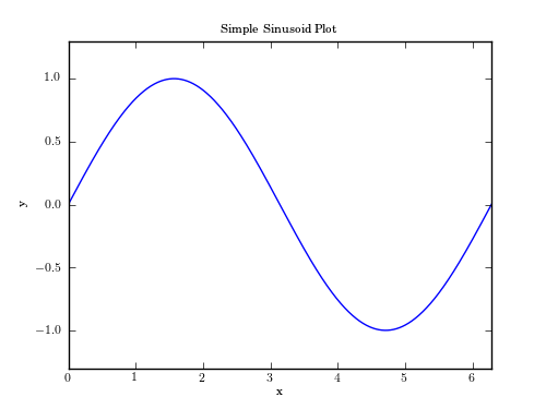
# First Example: simple plot
plt.figure(1, figsize=(5, 3.75))
x = np.linspace(0, 2 * np.pi, 1000)
y = np.sin(x)
plt.plot(x, y)
plt.xlim(0, 2 * np.pi)
plt.ylim(-1.3, 1.3)
plt.xlabel('x')
plt.ylabel('y')
plt.title('Simple Sinusoid Plot')
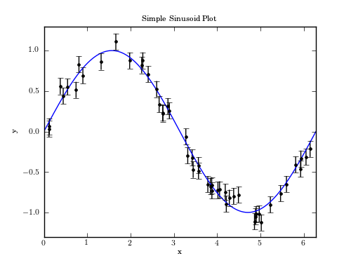
#------------------------------------------------------------
# Second Example: error-bars over simple plot
plt.figure(2, figsize=(5, 3.75))
x = np.linspace(0, 2 * np.pi, 1000)
y = np.sin(x)
plt.plot(x, y)
plt.xlim(0, 2 * np.pi)
plt.ylim(-1.3, 1.3)
plt.xlabel('x')
plt.ylabel('y')
plt.title('Simple Sinusoid Plot')
x_obs = 2 * np.pi * np.random.random(50)
y_obs = np.sin(x_obs)
y_obs += np.random.normal(0, 0.1, 50)
plt.errorbar(x_obs, y_obs, 0.1, fmt='.', color='black')
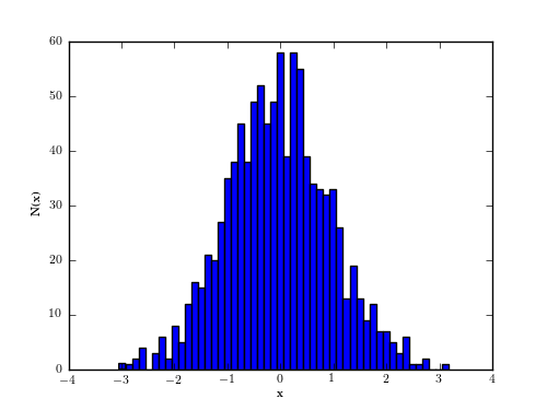
#------------------------------------------------------------
# Third Example: histogram
plt.figure(3, figsize=(5, 3.75))
x = np.random.normal(size=1000)
plt.hist(x, bins=50)
plt.xlabel('x')
plt.ylabel('N(x)')
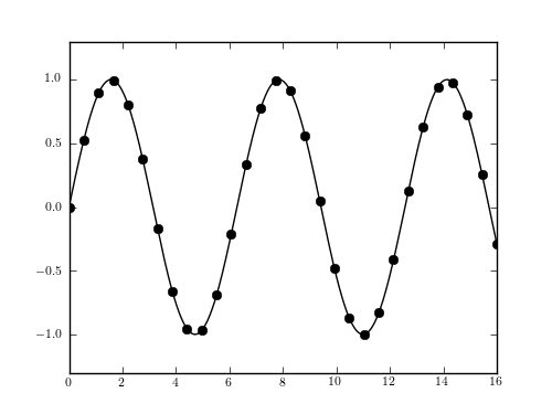
#------------------------------------------------------------
# Fourth Example: spline fitting
from scipy import interpolate
x = np.linspace(0, 16, 30)
y = np.sin(x)
x2 = np.linspace(0, 16, 1000)
spl = interpolate.UnivariateSpline(x, y, s=0)
plt.figure(4, figsize=(5, 3.75))
plt.plot(x, y, 'ok')
plt.plot(x2, spl(x2), '-k')
plt.ylim(-1.3, 1.3)
plt.show()