Clustering of LINEAR data
Figure 10.20
Unsupervised clustering analysis of periodic variable stars from the LINEAR data set. The top row shows clusters derived using two attributes (g - i and log P) and a mixture of 12 Gaussians. The colorized symbols mark the five most significant clusters. The bottom row shows analogous diagrams for clustering based on seven attributes (colors u - g, g - i, i - K, and J - K; log P, light-curve amplitude, and light-curve skewness), and a mixture of 15 Gaussians. See figure 10.21 for data projections in the space of other attributes for the latter case.
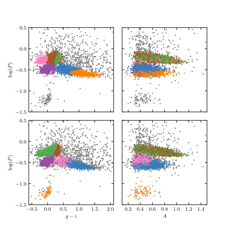
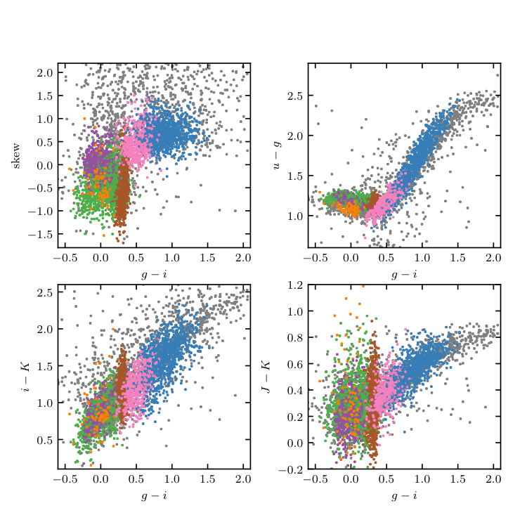
Figure 10.21
Unsupervised clustering analysis of periodic variable stars from the LINEAR data set. Clusters are derived using seven attributes (colors u - g, g - i, i - K, and J - K; log P , light-curve amplitude, and light-curve skewness), and a mixture of 15 Gaussians. The log P vs. g - i diagram and log P vs. light-curve amplitude diagram for the same clusters are shown in the lower panels of figure 10.20.
________________________________________________________________________________
fig_LINEAR_clustering.py is not compiling:
________________________________________________________________________________
# Author: Jake VanderPlas
# License: BSD
#   The figure produced by this code is published in the textbook
#   "Statistics, Data Mining, and Machine Learning in Astronomy" (2013)
#   For more information, see http://astroML.github.com
#   To report a bug or issue, use the following forum:
#    https://groups.google.com/forum/#!forum/astroml-general
from __future__ import print_function, division

import numpy as np
from matplotlib import pyplot as plt

from sklearn.mixture import GaussianMixture

from astroML.utils.decorators import pickle_results
from astroML.datasets import fetch_LINEAR_geneva

#----------------------------------------------------------------------
# This function adjusts matplotlib settings for a uniform feel in the textbook.
# Note that with usetex=True, fonts are rendered with LaTeX.  This may
# result in an error if LaTeX is not installed on your system.  In that case,
# you can set usetex to False.
if "setup_text_plots" not in globals():
    from astroML.plotting import setup_text_plots
setup_text_plots(fontsize=8, usetex=True)

#------------------------------------------------------------
# Get the Geneva periods data
data = fetch_LINEAR_geneva()

#----------------------------------------------------------------------
# compute Gaussian Mixture models

filetemplate = 'gmm_res_%i_%i.pkl'
attributes = [('gi', 'logP'),
              ('ug', 'gi', 'iK', 'JK', 'logP', 'amp', 'skew')]
components = np.arange(1, 21)

#------------------------------------------------------------
# Create attribute arrays
Xarrays = []
for attr in attributes:
    Xarrays.append(np.vstack([data[a] for a in attr]).T)


#------------------------------------------------------------
# Compute the results (and save to pickle file)
@pickle_results('LINEAR_clustering.pkl')
def compute_GaussianMixture_results(components, attributes):
    clfs = []

    for attr, X in zip(attributes, Xarrays):
        clfs_i = []

        for comp in components:
            print("  - {0} component fit".format(comp))
            clf = GaussianMixture(comp, covariance_type='full',
                      random_state=0, max_iter=500)
            clf.fit(X)
            clfs_i.append(clf)

            if not clf.converged_:
                print("           NOT CONVERGED!")

        clfs.append(clfs_i)
    return clfs


clfs = compute_GaussianMixture_results(components, attributes)

#------------------------------------------------------------
# Plot the results
fig = plt.figure(figsize=(5, 5))
fig.subplots_adjust(hspace=0.1, wspace=0.1)

class_labels = []

for i in range(2):
    # Grab the best classifier, based on the BIC
    X = Xarrays[i]
    BIC = [c.bic(X) for c in clfs[i]]
    i_best = np.argmin(BIC)

    print("number of components:", components[i_best])

    clf = clfs[i][i_best]
    n_components = clf.n_components

    # Predict the cluster labels with the classifier
    c = clf.predict(X)
    classes = np.unique(c)

    class_labels.append(c)

    # sort the cluster by normalized density of points
    counts = np.sum(c == classes[:, None], 1)
    size = np.array([np.linalg.det(C) for C in clf.covariances_])
    weights = clf.weights_
    density = counts / size

    # Clusters with very few points are less interesting:
    # set their density to zero so they'll go to the end of the list
    density[counts < 5] = 0
    isort = np.argsort(density)[::-1]

    # find statistics of the top 10 clusters
    Nclusters = 6

    means = []
    stdevs = []
    counts = []

    names = [name for name in data.dtype.names[2:] if name != 'LINEARobjectID']
    labels = ['$u-g$', '$g-i$', '$i-K$', '$J-K$',
              r'$\log(P)$', 'amplitude', 'skew',
              'kurtosis', 'median mag', r'$N_{\rm obs}$', 'Visual Class']

    assert len(names) == len(labels)

    i_logP = names.index('logP')

    for j in range(Nclusters):
        flag = (c == isort[j])
        counts.append(np.sum(flag))
        means.append([np.mean(data[n][flag]) for n in names])
        stdevs.append([data[n][flag].std() for n in names])

    counts = np.array(counts)
    means = np.array(means)
    stdevs = np.array(stdevs)

    # define colors based on median of logP
    j_ordered = np.argsort(-means[:, i_logP])

    # tweak colors by hand
    if i == 1:
        j_ordered[3], j_ordered[2] = j_ordered[2], j_ordered[3]

    color = np.zeros(c.shape)
    for j in range(Nclusters):
        flag = (c == isort[j_ordered[j]])
        color[flag] = j + 1

    # separate into foureground and background
    back = (color == 0)
    fore = ~back

    # Plot the resulting clusters
    ax1 = fig.add_subplot(221 + 2 * i)
    ax1.scatter(data['gi'][back], data['logP'][back],
                c='gray', edgecolors='none', s=4, linewidths=0)
    ax1.scatter(data['gi'][fore], data['logP'][fore],
                c=color[fore], edgecolors='none',  s=4, linewidths=0)

    ax1.set_ylabel(r'$\log(P)$')

    ax2 = plt.subplot(222 + 2 * i)
    ax2.scatter(data['amp'][back], data['logP'][back],
                c='gray', edgecolors='none', s=4, linewidths=0)
    ax2.scatter(data['amp'][fore], data['logP'][fore],
                c=color[fore], edgecolors='none', s=4, linewidths=0)

    #------------------------------
    # set axis limits
    ax1.set_xlim(-0.6, 2.1)
    ax2.set_xlim(0.1, 1.5)
    ax1.set_ylim(-1.5, 0.5)
    ax2.set_ylim(-1.5, 0.5)

    ax2.yaxis.set_major_formatter(plt.NullFormatter())
    if i == 0:
        ax1.xaxis.set_major_formatter(plt.NullFormatter())
        ax2.xaxis.set_major_formatter(plt.NullFormatter())
    else:
        ax1.set_xlabel(r'$g-i$')
        ax2.set_xlabel(r'$A$')


    #------------------------------
    # print table of means and medians directly to LaTeX format
    print(r"\begin{tabular}{|l|lllllll|}")
    print(r"   \hline")
    for j in range(7):
        print('   &', labels[j], end=" ")
    print(r"\\")
    print(r"   \hline")

    for j in range(Nclusters):
        print("   {0} ".format(j + 1), end=' ')
        for k in range(7):
            print(" & $%.2f \pm %.2f$ " % (means[j, k], stdevs[j, k]), end=' ')
        print(r"\\")

    print(r"\hline")
    print(r"\end{tabular}")

#------------------------------------------------------------
# Second figure
fig = plt.figure(figsize=(5, 5))
fig.subplots_adjust(left=0.11, right=0.95, wspace=0.3)

attrs = ['skew', 'ug', 'iK', 'JK']
labels = ['skew', '$u-g$', '$i-K$', '$J-K$']
ylims = [(-1.8, 2.2), (0.6, 2.9), (0.1, 2.6), (-0.2, 1.2)]

for i in range(4):
    ax = fig.add_subplot(221 + i)
    ax.scatter(data['gi'][back], data[attrs[i]][back],
               c='gray', edgecolors='none', s=4, linewidths=0)
    ax.scatter(data['gi'][fore], data[attrs[i]][fore],
               c=color[fore], edgecolors='none', s=4, linewidths=0)
    ax.set_xlabel('$g-i$')
    ax.set_ylabel(labels[i])

    ax.set_xlim(-0.6, 2.1)
    ax.set_ylim(ylims[i])

#------------------------------------------------------------
# Save the results
#
# run the script as
#
#   >$ python fig_LINEAR_clustering.py --save
#
# to output the data file showing the cluster labels of each point
import sys
if len(sys.argv) > 1 and sys.argv[1] == '--save':
    filename = 'cluster_labels.dat'

    print("Saving cluster labels to", filename)

    from astroML.datasets.LINEAR_sample import ARCHIVE_DTYPE
    new_data = np.zeros(len(data),
                        dtype=(ARCHIVE_DTYPE + [('2D_cluster_ID', 'i4'),
                                                ('7D_cluster_ID', 'i4')]))

    for name in data.dtype.names:
        new_data[name] = data[name]
    new_data['2D_cluster_ID'] = class_labels[0]
    new_data['7D_cluster_ID'] = class_labels[1]

    fmt = ('%.6f   %.6f   %.3f   %.3f   %.3f   %.3f   %.7f   %.3f   %.3f   '
           '%.3f    %.2f     %i     %i      %s          %i              %i\n')


    F = open(filename, 'w')
    F.write('#    ra           dec       ug      gi      iK      JK     '
            'logP       Ampl    skew      kurt    magMed    nObs  LCtype  '
            'LINEARobjectID  2D_cluster_ID   7D_cluster_ID\n')
    for line in new_data:
        F.write(fmt % tuple(line[col] for col in line.dtype.names))
    F.close()

plt.show()