Phased LINEAR Light Curve
Figure1.7.
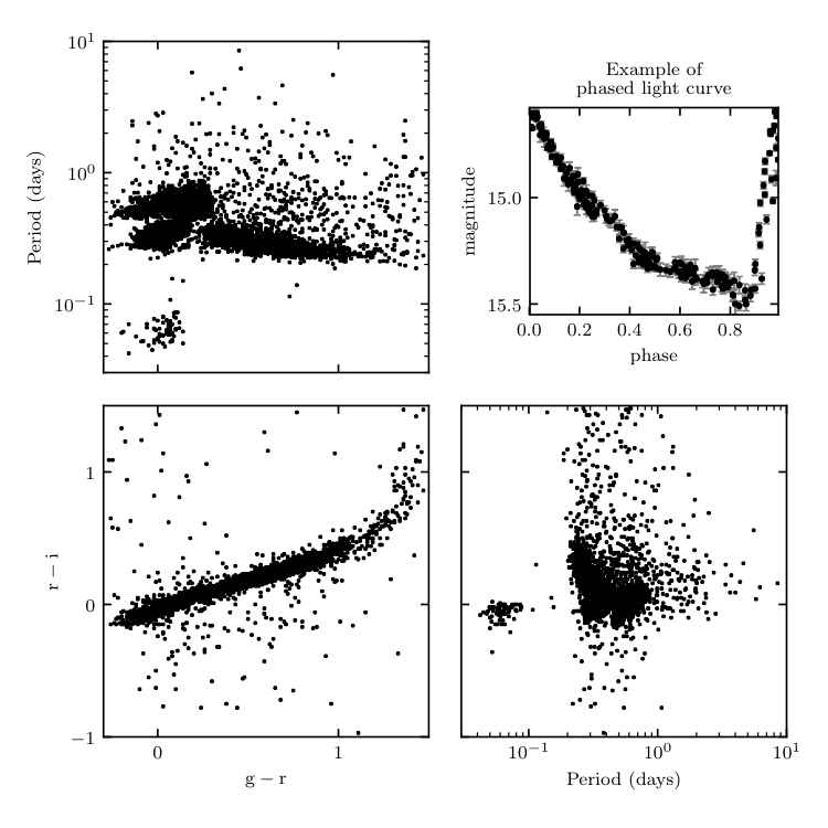
An example of the type of data available in the LINEAR dataset. The scatter plots show the g-r and r-i colors, and the variability period determined using a Lomb-Scargle periodogram (for details see chapter 10). The upper-right panel shows a phased light curve for one of the over 7000 objects.
________________________________________________________________________________
fig_LINEAR_sample.py is not compiling:
________________________________________________________________________________
# Author: Jake VanderPlas
# License: BSD
#   The figure produced by this code is published in the textbook
#   "Statistics, Data Mining, and Machine Learning in Astronomy" (2013)
#   For more information, see http://astroML.github.com
#   To report a bug or issue, use the following forum:
#    https://groups.google.com/forum/#!forum/astroml-general
import numpy as np
from matplotlib import pyplot as plt
from astroML.datasets import fetch_LINEAR_sample, fetch_LINEAR_geneva

#----------------------------------------------------------------------
# This function adjusts matplotlib settings for a uniform feel in the textbook.
# Note that with usetex=True, fonts are rendered with LaTeX.  This may
# result in an error if LaTeX is not installed on your system.  In that case,
# you can set usetex to False.
if "setup_text_plots" not in globals():
    from astroML.plotting import setup_text_plots
setup_text_plots(fontsize=8, usetex=True)

#------------------------------------------------------------
# Get data for the plot
data = fetch_LINEAR_sample()
geneva = fetch_LINEAR_geneva()  # contains well-measured periods

# Compute the phased light curve for a single object.
# the best-fit period in the file is not accurate enough
# for light curve phasing.  The frequency below is
# calculated using Lomb Scargle (see chapter10/fig_LINEAR_LS.py)
id = 18525697
omega = 10.82722481
t, y, dy = data[id].T
phase = (t * omega * 0.5 / np.pi + 0.1) % 1

# Select colors, magnitudes, and periods from the global set
targets = data.targets[data.targets['LP1'] < 2]
r = targets['r']
gr = targets['gr']
ri = targets['ri']
logP = targets['LP1']

# Cross-match by ID with the geneva catalog to get more accurate periods
targetIDs = [str(ID).lstrip('0') for ID in targets['objectID']]
genevaIDs = [ID.decode('utf-8').lstrip('0') for ID in geneva['LINEARobjectID']]

def safe_index(L, val):
    try:
        return L.index(val)
    except ValueError:
        return -1

ind = np.array([safe_index(genevaIDs, ID) for ID in targetIDs])
mask = (ind >= 0)

logP = geneva['logP'][ind[mask]]
r = r[mask]
gr = gr[mask]
ri = ri[mask]

#------------------------------------------------------------
# plot the results
fig = plt.figure(figsize=(5, 5))
fig.subplots_adjust(hspace=0.1, wspace=0.1,
                    top=0.95, right=0.95)

ax = fig.add_axes((0.64, 0.62, 0.3, 0.25))
plt.errorbar(phase, y, dy, fmt='.', color='black', ecolor='gray',
             lw=1, ms=4, capsize=1.5)
plt.ylim(plt.ylim()[::-1])
plt.xlabel('phase')
plt.ylabel('magnitude')
ax.yaxis.set_major_locator(plt.MultipleLocator(0.5))
plt.title("Example of\nphased light curve")

ax = fig.add_subplot(223)
ax.plot(gr, ri, '.', color='black', markersize=2)
ax.set_xlim(-0.3, 1.5)
ax.set_ylim(-1.0, 1.5)
ax.xaxis.set_major_locator(plt.MultipleLocator(1.0))
ax.yaxis.set_major_locator(plt.MultipleLocator(1.0))
ax.set_xlabel(r'${\rm g-r}$')
ax.set_ylabel(r'${\rm r-i}$')

ax = fig.add_subplot(221, yscale='log')
ax.plot(gr, 10 ** logP, '.', color='black', markersize=2)
ax.set_xlim(-0.3, 1.5)
ax.set_ylim(3E-2, 1E1)
ax.xaxis.set_major_locator(plt.MultipleLocator(1.0))
ax.xaxis.set_major_formatter(plt.NullFormatter())
ax.set_ylabel('Period (days)')

ax = fig.add_subplot(224, xscale='log')
ax.plot(10 ** logP, ri, '.', color='black', markersize=2)
ax.set_xlim(3E-2, 1E1)
ax.set_ylim(-1.0, 1.5)
ax.yaxis.set_major_formatter(plt.NullFormatter())
ax.yaxis.set_major_locator(plt.MultipleLocator(1.0))
ax.set_xlabel('Period (days)')

plt.show()